Showing posts with label paper goods. Show all posts

A few paper goods projects

From Maia, I learned about this concept of a "wedding tree."


Basically it's a poster with an image of a tree on it that you set up at the reception with an ink pad, a test notepad of paper, and perhaps some wipes for people to clean their hands, and they put their thumbprint along the tree branches as the "leaves" and sign their names around it. Etsy has a good number of different printable designs. I think this is a pretty neat idea, because you then end up with basically a poster that you can hang in your home.

I will not be doing this as I don't think there will be that many kids at the reception, but if you were having many younger guests and wanted to set up activities for them, this DIY coloring book using photos project would be pretty fun, I think.


And also, we got our first wedding present the other day (thank you again to the Lius, many-generational family friends on my mom's side)! Which got me to thinking about getting some nice thank you cards. Dan doesn't really get why I want non-everyday thank you cards, but I'm pushing for them anyway. I came up with a photo-based idea to be printed at Overnight Prints that's waiting on the wedding bands arriving, but I also found these letterpressed thank you cards on Etsy with that double happiness character in the background:

$3.50 per individual card, plus shipping

It's quite an elegant design, I think. I contacted the seller about making up an order of 50 cards with design but the Chinese character for thanks in the background instead of the double happiness, and she was really open to the idea, offered to customize the border colors, and also threw in a bulk order discount.

An excellent reaction to the invitation

Subject: Just thought I'd mention
that I like your invitations so much, with the double happiness symbol tied to the front, that I'm trying my hardest not to disturb the original design. This means, effectively, that I can't open it all the way. I have to sort of move the thread around when I want to read the text. I am perhaps doomed never to see the directional maps you included on the inside; can I call if I get lost?
I've been loving the positive responses we've been getting in response to the invitations (the negative ones I haven't heard directly and so can't form an opinion on those, of course) and just wanted to share this recent one. It's from one of our high school friends who I didn't even really think of as one to notice wedding-related aesthetic details. Yay!

Invitation development and wording

Just a couple more images:

A simple way to get some colorful artwork onto a card: grid filled in with different mixed colors of acrylic paint (mer mag)

"Los Angeles" invitation suite by KenzieKate (via Oh So Beautiful Paper, of course)

I love this design, enough to even actually try to look what the cost would be to just pick this and get the invitations done. It's the colors, the graphic chevron stripes (I'm not sure whether this trend is just starting up or if it's already fading away, but I don't care), the handwriting font, and the clever placement of red text for emphasis. I appreciate that this business' website gives you a price calculator, but $1250 (about 50% of our venue cost) for invitations that I hope will at least be recycled just isn't going to happen here.

I came across this in my email the other day and realized I'd forgotten to share this poster Amy (she of the save-the-date design) one day when she was "goofing off." I don't know about you, but when I goof off, I generally don't end up with anything out of it, much less an adorable design of some sort:

Does the state of NJ look like a seahorse shape to anyone else?

Lately to try to make my weekday evenings a bit more productive, I try to set myself just one goal for the night, with my laptop down at 10pm to help me get to bed earlier. A couple weeks ago, I set myself the goal of going through my archives of invitation designs I've really liked to try to categorize the different aspects of what I'd like to have. They include:
  • Stitching details: fabric overlay with words printed onto fabric, stitch into paper directly, stitch two layers of paper together, broken line border, fabric envelope
  • Type as graphic design: modern and bold plus handwriting detail
  • Typewriter: as font, on vellum paper
  • Circles
  • Kraft paper: contrasting the rougher brown texture with something dainty, like a lace doily
  • Illustrations/line drawings
  • Papercuts
  • Other little details: rounded corners, colors in general, fabric tape, pennant stamp, letterpressed text
  • Envelopes: templates, Google Maps
Which is a lot to be going on with (I won't do everything all at once), but I'm hoping to get more traction here by giving myself clear next steps for what to research and test. I want to have the invitation ready to be mailed out in mid-April, which gives me about a month to get them all done.

I also need to figure out the wording on the invitation, of course. Robin's post on trying to do so is very funny. I think we're going to go with the suggestions we've received about just saying something like "Join us for hors d'oeuvres, drinks, and pies galore" rather than including the full menu and then posting the full menu to the wedding website. 

The trickier item item of invitation wording is going to be designating the dress code, I think. Amid Privilege posted her mother's advice for wedding invitation dress codes, which includes not saying what's not allowed and recommends using standard dress code wording if possible (Cocktail, not Semi-Formal), leaving it up to guests to figure out the rest given the style of the invitation, what they know of the couple, and the time and location of the wedding. I probably might give more examples in the FAQ of the wedding website for those that want more guidance. Handwringing over what's appropriate to wear to a certain event and fears about being over- or under-dressed waste enough of everyone's energy everywhere else already.

Chinese family naming system

So, I just addressed the last of the save-the-date postcards this weekend. I went to my parents' place for Chinese New Year dinner and tried to pry a few more relatives' addresses out of them. I think about wedding guests in a very relational way, with associated responsibilities. For example, if it's through my dad's side that I am related to this person and are therefore inviting them, I expect my dad to help with procuring the necessary information.

We did the same thing in the first round with getting addresses for Dan's side of the guest list, but my parents have been less forthcoming. I think they're a bit of the attitude, "if you can't reach someone via email, why bother with mailing addresses, just use the phone." They played it off as giving me an opportunity to reach out to my cousins for their parents' addresses. Luckily, these cousins came through for me, and very quickly at that, too, so I looked up the last few kinship terms on this helpful chart and wrote them out in my likely worse than a Chinese kindergardener's writing. It's the thought that counts, yeah?


I'd mentioned briefly in the last post about the save-the-date postcards about how I had to look up then which were the right terms to use for different family members, based on how I'm related to them. This chart I found this time around, though, better visually describes the precision to which you can name a relationship in the Confucian system.

Really gives you a sense for a non-Western culture in which your relationship to other people and your relative ages are more important than your individuality, since at family gatherings, you wouldn't really address anyone outside of your own generation with their given names. Instead, you'd use the appropriate kinship term (after a hushed conference with your parents, generally) and respectfully greet everyone. "Hello, 3rd uncle older than my father, 3rd uncle's wife. Hello, 2nd aunt older than my father, 2nd aunt's husband."

It's a complicated system, but it mostly makes sense since it's all based around the principles of increasing respect with increasing age (and a bit of, more important to distinguish males than females, which sometimes sets my mom off on how Confusion culture is patriarchal, which I'm really amused by because she mostly lives a feminist life but doesn't usually go off on feminist rants). It makes more sense to me than the Western system with all the "once removed" or first/second/etc. business. I can mostly remember the Chinese kinship terms now, though it's nice to be to easily look them up now too (yay Internet!) but I can never remember the right designations in the Western system.

Anyway, just wanted to share a bit of Chinese culture there, since in general people seem to find it interesting that I often have no idea what my relatives' real full names are (in English or in Chinese), because I only know them by their numbered designation.

The final, tangible save-the-date postcards

Ta da! After all those different designs, here's what we ended up going with.
It's a combination of my two favorites from the last round of designs, plus my remembering the Chinese double happiness character. The 618 in the corner is supposed to reference Scrabble tile numbers...not sure if that will be apparent to everyone, but I like it.

Here's what an order of 66 postcards looks like in real life:

I really like the rounded corners because of how they echo the rounded squares in the design, definitely worth the extra $1.

Yup, I'd ordered 50 postcards, but they sent us 66 instead. The extra 16 on the left, 50 on the right.

66 postcards take up less space than I thought it would, the whole thing came in one of those slightly larger UPS envelopes. I was very pleased with Overnight Prints overall, I think you could discern the slightly lower quality of digital printing if you stared at it a bit, but it's not immediately apparent, as Robin said. The paper was nice and thick and the surfaces were shiny and smooth. The order was guaranteed to be delivered by Friday but they made the first attempt on Thursday, so the shipping was pretty quick as well.

I did have to test out a couple pens to find one that wouldn't smear and ended up using my green space pen that I got a Christmas present from my college roommate Emily in '09 (love that thing). It took me about...2 hours? To address my half of the guest list, but this included calling my mom to harass her about getting a couple more relatives' address (still waiting on this) and to check which names were the right ones to use, as well as looking up Chinese characters online (the word for an uncle who's older than my dad is different than for an uncle that's younger than my dad, for instance) and practicing them a bit so they wouldn't look entirely like a kindergartener's scrawl. I also wrote quick personal messages on each of them.

Dan, on the other hand, took 30 minutes to fill in the addresses and note that people could invite a guest if they liked.

It balances out, though, because he took all the ones that needed to be mailed out (40) and got them stamped. The postage came to $11.20 (28 cents to mail a postcard, currently) so the whole save-the-date postcard endeavor came to just about $31. Thanks again to Amy for designing them and putting up with all my requests through the whole process!

I probably need to stop collecting invitation ideas soon

Brilliant handkerchief invites by printing custom fabric with a square map design at Spoonflower and then cutting up the fabric to make handkerchiefs.

I've always really liked clean line drawings, like Danny Gregory's. Every so often I try to get into sketchbook journaling because I'd like to be able to document surroundings like this (Oh So Beautiful Paper)

Amazing laser cut gatefold, closed with a wax seal by Paisley Quill, via Oh So Beautiful Paper. I think this could be translated to a really cool design with red Chinese papercuts. Which I've totally posted about before, heh.


Simple but clever printable mailer template from Lisa Rupp for Gifted Magazine, pg. 129.

Envelope template from Melissa of IS•LY

Also not a specific design but something that may be useful: design*sponge's favorite fonts roundup.

Quick note on ordering custom postcards online

I just ordered our save-the-date postcards from Overnight Prints to arrive by next Friday for just under $20. I went with them over VistaPrint because OP's interface is friendlier and gives you more space for your design on a 4x6" postcard. They have about equivalent review ratings. VP was a bit less hassle to figure out the cheapest price I could get 50-100 postcards printed with them, as they have just a free postcards offer going on, but their shipping is pretty outrageous.

OP, on the other hand, had quite a few different promo codes/links that I could enter in, which changed the final amount by a few dollars here and there. So, word of advice: mess around with the promo codes if you're going to buy from one of these online companies. Note down any that you see in the AdWords ads on Google search results too, because I could've sworn I saw one that said 100 free postcards, but then I couldn't find that code again.

I will report back with my thoughts on the quality of their printing (I chose the "value" digital press since we could get a run of just 50 instead of 100 that way) and the final final design once they arrive and get sent out.

More save-the-date designs

No worries, you don't have to vote again, I just wanted to share these because I'm so impressed by Amy's work and want to showcase it. I also find it interesting to see the evolution of designs, but you should probably ignore this post if you're anywhere near being a bit like, "omg it doesn't matter, just make a decision already," though.

#1

#2
 

#3

#4
 

#5

#6

#7 & #8

Dan likes #2 best ("keep it simple") and I like #3-#8 all a lot, particularly the ones that get cleverer with the Scrabble tile thing, but there are minor pros/cons to each. I keep asking people around me for their opinion and it varies a lot, mostly depending on how important they think it is to have our engagement photo be in a prominent position.

Anyway, thank you, Amy, for all the help you've given me so far, as well postponing your plans for the summer until another year in order to be able to make it to our wedding (!). I feel so loved, especially after a visit this weekend from Emily who has enthusiastically volunteered to take up researching hotel blocks and potential post-reception destinations in Princeton, as well as organizing some kind of bachelorette party weekend (by which I mean, gather all my female friends into one place for a weekend prior to the weekend of the wedding so we can hang out and chat and craft while watching sci-fi, or something along those lines). Thank you.

Help me pick a save-the-date design

Why hello there. Since the last post on this blog a month and a half ago, we:
  • booked an officiant (Celia Milton)
  • met with our day-of coordinator (Carina of Luxe Events--she's really lovely)
  • went to see our band (B.D. Lenz) at a "gastropub", which made us feel really good about our band choice again, and finalized the composition of said band: guitar, bass, drums, saxophone, male vocalist, female vocalist
  • scheduled a visit to the rental company (Brillman's Rental Barn) with our caterer for January
That last one I just did today and it's not like we've actually gone yet and had to actually pick out the colors of our linens and such. The idea of having to make those kinds of decisions fills me with a vague anxiety (what if the linens don't truly express the core color of our personalities?!????) but it's probably good to get it over with. Oh, I did also finish my dressmaking class at Sew Fast Sew Easy which is sooort of wedding-related, and I've bought a serger with some Christmas present money...those of kind of wedding task related too! Are too!

My next actual concrete goal is to get out save-the-dates in January, and after that, put together a project plan and timeline for craftiness to get done in the remaining...less than 6 months. Eek. Somehow now that the big decisions of booking vendors have mostly been made, I find myself dragging my feet on making decisions about all the smaller stuff that I'd been looking forward to as the fun part. I think it's because each decision closes off potential.

So, I need help figuring out the save-the-dates. My friend Amy very kindly put together some mocks for me, and I'd like you to vote/comment on them to help me decide what will be the least annoying when put on someone's fridge for 5 months:

In the postcards to be printed at Vistaprint category:

Option 1, by Amy (would have to be tweaked to fit in an address/stamp area somewhere)

Option 2, by Amy (would have to be tweaked to fit in an address/stamp area somewhere). Also Dan would want to remove the "OMG" bit.
Option 3, thrown together by me. The back would be your typical postcard split. Photo subject to change.
In the "other" category, these Polaroid postcards from Photojojo, the idea of which I'm kind of in love with:


which would look something like this, if I had the Scrabble photo printed up at CVS and round circle stickers made at Zazzle:

Option 4, by Amy (Option 5, the same thing but switch out Scrabble photo for something else)
We have about 40 households that we need to send these save-the-dates to, so with that as the estimate, getting postcards printed up at Vistaprint will have an end result of around $2.77/card, while the Polaroid postcards would be around $1.62. That doesn't seem like much of a difference but it amounts to around $50, with many fewer spares of the Polaroid postcards and much more assembly required. The difference is around $25 without the Zazzle circle stickers. And I don't know if I or the people receiving these will even like the Polaroid postcards more.

Ok, so, time to vote! Likely actual recipients should de-lurk and express their opinion as well. "I don't really care about having a photo of yours on my fridge for the next few months, no thanks" is fine to express too.


On Mismatched Expectations

I am a firm believer in the importance of expectations. Take a simple example. Let's say you're a parent, and you are driving your child to get blood drawn for the first time. The child senses that something is going to happen but is not sure what. He asks, "Mommy/Daddy, what's 'getting blood drawn?'"

I see three courses of action here:
  1. Downplay it: "Oh, it's nothing! It'll feel like a little pinch."
  2. Exaggerate it: "It's going to feel like you left your arm on a hot stove for several minutes."
  3. Level with the child: "It will sting a little and will feel a little strange for about a minute, but you'll be OK."
Now, I would bet that it's about an even split between parents who choose Option A and Option C, with a small minority of sadists and humourists selecting Option B. As someone who believes firmly in establishing expectations, I would skew towards C.

Why? Well, it's mainly a process of elimination choice. If I go with A, and my child is particularly sensitive to pain (something that is hard to gauge when dealing with someone else's nerve endings), the child will be (rightfully) annoyed with me for misleading them. If I go with B, the child will likely panic for the remainder of the drive; their relief when the blood is actually drawn (if the blood ever gets drawn) will be nice, but likely small satisfaction. A prolonged reliance on B-like strategies will also presumably cause psychological traumatization (from here).

B, on the other hand, offers fair expectations to the child. They will be nervous, and I may be forced to offer additional reassurance, but they now know what to expect.

People act on expectations all the time. If they expect that new flat screen TV to drop in price for the holidays, they may postpone their purchase for another month. If they expect to get a raise, they may start spending a bit more money in advance. If they expect to have to skip lunch, they may eat a larger breakfast, or may pack a Nutri-Grain bar for the road.

Like most things, weddings are about expectations. Everyone who heard that Katherine and I got engaged had some expectations about what the wedding will actually look like. Likewise, everyone who gets an invitation will, for at least a moment or two, create a picture--or, rather, a mental model--of how the wedding will look.

(This is another one of those principles for me. Back when I was in an educational psychology class, we talked a bit about mental models in learning. One of the jobs of a teacher is to help students draw accurate, understandable mental models of reality; the mental model of the solar system for a third grader will inevitably be less sophisticated than the mental model for an astronomer, but both models need to depict the abstract concept in a concrete way in order to be effective. I see the wedding the same way.)

Mismatched expectations lead to conflict, fights, divorce, miscommunication, wars, and all manners of other problems. Take weddings. If John likes to drink, and assumes that weddings will have alcohol, but sees no alcohol when he arrives, John will be angry. If, however, John has been informed in advance of the dryness of the wedding, John will adjust his expectations accordingly (or wisely send a small gift and skip the affair altogether).

I anticipate that the most controversial aspect of the wedding will be the choice of food. We have made two potentially-unpopular decisions:
  1. We will not be serving a full meal; the menu calls for a variety of hors d'oeuvres and other light fare.
  2. We will not be serving a traditional wedding cake, having decided that pies are better, and more interesting, than cake.
Thus, going forward, we have two places for potential disappointment or, worse, outward anger (particularly when combined with freely-available social lubricant). My goal here is to determine how best to enhance the mental models of our guests, and head off any potential problems before the wedding day.

I see a few different ways to do this:
  1. Strategic leaking: We can leak to select potential (chatty) wedding guests that the menu will be mostly hors d'oeuvres, and that we are serving pies, rather than cake.
  2. Publicly-available website: We can direct people on the invitations to this blog or our wedding website, which will have the full menu available to readers, well-wishers, and guests.
  3. Invitation enclosures: We can include a copy of the menu in the wedding invitation.
  4. Caveat emptor: We can do nothing, and conduct a small social experiment.
Option A gives me the enjoyment of categorizing our guests according to their interconnectedness (and loquaciousness), which might be perversely fun. Sadly, I think it is ultimately too difficult to verify that the information has been passed.

Going with only Option B requires a good bit of additional work from the guests. Most people will not visit a website that they receive on a piece of snail mail. People are busy, and have far more important things to worry about than our wedding. (As my mother would say, it's probably not in "their top two.") By the time they start thinking about the wedding, it is quite possible that the invitation was lost, or that the information was written elsewhere.

I personally am leaning towards Option C, likely in combination with B. It is the most direct and transparent way to circulate the information that I want to circulate. It also, I think, gives people a chance to look inside the process a bit, and to feel involved.

In another context, Option D could be fun. But I would like to get the marriage off on the right foot. There are thousands of potential flashpoints in this sort of social interaction; as the logistics guy here, my goal is to minimize them.

So, as of now, I am in favor of including the full menu along with our invitations, preferably on some sort of ceremonial stationery, along with posting it on the website. Katherine agrees, but we're still trying to figure out a way to word it and make it look classy. Any ideas?

Engagement photos!!

Thank you everyone who commented and clamored for the engagement photos in the last post. I'm really touched that people I know only through the internet caring. I've delayed on this a bit because I had some emotions to work through, which I decided to just put into another post about body image and self-esteem entirely. So here are my top picks, with a slideshow of the full set available here.

We started out in our 'formal' outfits, which for me was a mod acid yellow and gray 60s shift from Empire Vintage Clothing and for Dan was his light gray suit that I talked him into getting tailored. Man, the amount of excess fabric they took out!

This is the Hoboken train terminal waiting room, which is gorgeous and looks a bit like Grand Central Station but with fewer people. Sadly an NJTransit cop shooed us away pretty quickly (Kelly was awesomely quick on her feet and told the guy she was Dan's sister) because apparently you need a permit? But I searched and searched afterwards and didn't find anything on their website about applying for one, so in my mind that means it can't be true. I'm still a little peeved that we missed out on the grand shots of the big staircase, but you get a bit of the idea from here.


Kelly was so great about constantly directing us to move closer to each other and to show some affection, just like Amy had told us we should try to do more of.

Mmm vintage-y post-processing effect.

Fie on ugly but necessary signs marring the frame.

I like this one a lot because because I think I look like I feel a bit sassy here. Hellz yeah bright blue dress that's also from Empire Vintage Clothing. Can you guess what that is behind us?

It's the outside of a parking garage in Hoboken! We were walking from the train station to the park at 4th and Hudson and chatting as we went along and then Kelly stops in the middle of a sentence and just says something along the lines of, "Oh my god what is that I love it we are going there to take photos now." Ok!

There was a guy sitting on a bench towards that right that kept telling Kelly she was doing it wrong because the sun was behind us. She showed admirable restraint there, I think.

This is the same park, we just ducked into a small clump of trees and Kelly managed to make it seem like we were in a forest, which was one of the settings that I wanted all along but thought we couldn't make it work with the urban thing together.

Joint effort from Dan, Kelly, and myself. 

I love, love the concept for a save-the-date card (which I think we are going to end up doing after all) but may want to re-do it with a vintage Scrabble board instead so that the board isn't as distractingly colorful, or maybe use some Photoshop effect so that the tiles look illustrated somehow, or do just the tiles and overlay it on another image, like a vintage map of Princeton or NJ. Dan's preference is for something like this from the battles of Princeton and Trenton. Ugh history. Anyway, that'd be on one half of a postcard and another one of these images on the other half. Gets the point across, hopefully, and people can put it on their fridge if they want.

By this point we were already running over on Kelly's time but she never said a word and got this bubble shot that I really wanted in.

So overall, Kelly is basically the most energetic and enthusiastic person I've ever met. She really was wonderful about directing us into poses and making us laugh. I think you can tell that we definitely relaxed into it as the shoot went on, which is the whole point of doing an engagement shoot after all.

Given that, I kind of overprepared for the shoot in terms of props and such. I made a list, checked it twice, and packed everything into my granny cart which was useful for hauling things around but I really didn't need 3 different belts options and more earrings/necklaces/shoes/books etc. As Kelly pointed out when we talked over the phone a few weeks beforehand, the shots of her other couples that I liked the best were the ones where the couples were doing some activity together and yet I clung to having many prop options as a safety line, I suppose. Ah well, so it goes.

For makeup this time around, I scheduled a makeup trial with Jennifer Kang at Mona's in Englewood Cliffs. She was really nice and in a happy coincidence, she happened to be doing these trials for free on the day of our shoot anyway. I regret that I didn't leave her a small tip of some kind just for her time. She applied some fantastically long false lashes that felt pretty weird at first but that I got used to eventually. They weren't too hard to remove at the end of the day, though I needn't have worried at all about them falling out. I'm surprise that they didn't show up more in the photos because they looked enormous to me in the mirror. I also learned from her that you can apparently buy these stickers at Asian grocery stores to put on single-fold eyelids at night to have a double fold in the morning. Weird! And yet, intriguing!

Dan, again, thought there was too much makeup on but I think you can't really tell that there's very much in the photos. I almost want a bit more eye makeup and a stronger lip color, and definitely for my eyebrows to be filled in a bit more, I think. Still, I remain undecided as to whether the minimalistic makeup look I want is worth paying a professional to do. I can buy the makeup and practice myself...but I probably won't do the practicing part of it. I think my sister also wants to the use the occasion to really go for all the beautifying things, since she never went to prom.

So it may be a small thing that ends up being worth throwing money at, but I'm still not quite sure. Plus, a hair person would be separate, and yet there's not much I want done except for it to be blown out nicely. Mama G suggested finding a salon in the Princeton area that I would go to on the morning of to get the blowout and a makeup application but I want to minimize the amount of running around needed that morning. Maybe a place like this La Jolie Hair Salon which has full face regular makeup starting at $45 and a shampoo and blow-dry at $36. The fine print says wedding day work starts at $100 but I'm not too fussed about going in there and not telling them that it's for a wedding.

In conclusion:
  1. I heart Kelly.
  2. I remain unsure about the makeup thing.
  3. I have body image and self-esteem issues to work on that I didn't know I had. More to come on this.

Another invitations round-up

Free templates at download & print by Anna Skye, via 2000 Dollar Wedding.


Loved the color scheme and font usage/placement in my girl Angie's invites, as designed by her husband-in-7-days (!) Josh:


I really like how the broken line border looks like stitches in Delphine Press' Hibiscus design, via Oh So Beautiful Paper.

Also a fan of the fun and bright yellow and blue color scheme

One way to incorporate the fabric/stitching/DIY feel to the paper goods might be sewing an outline around something, using bright embroidery thread. Once we get our engagement photos back, I'll take a look at them and see if we could convert one into a suitable save-the-date postcard, jazzed up a little.

I just like the look of this vintage airmail inspired set, even though it wouldn't really fit for us:

My mother used to get letters from her friends/relatives in China with that airmail border. Not so much anymore, though.

Map-lined envelopes! Too much work (if I'm going to spend that kind of effort, I'd go all out with the map envelopes, but I know that I'd at least appreciate this detail if I were to ever receive one myself.

Again with the graphic design using type, via the haystack needle.

It is a nice contrast to have the hand-lettered portion.

They included the menu with their invitations, which is something Dan wants to do, to make clear what the food will be like upfront.

Speaking of the food, our caterer came up with a delicious sounding prosecco bar! It'll include: sliced strawberries, mango puree, fresh orange juice, herbed simple syrup, and lemon twists, bitters and sugar cubes for the prosecco version of this champagne cocktail. I'm pretty excited, though I do still have to taste prosecco first, heh.

Back to invitations: this set came in a sweet little seersucker pocket (via Oh So Beautiful Paper).

I think the pocket then also fit inside the envelope. Probably too fussy for utility gained overall (I guess the idea is that envelopes are easily torn up and this would help keeps all the little bits of paper together better?).

And for the last item, I could see this tutorial on making your own fabric tape (costs $8 for the sticker machine to get started, then about $0.25/ft thereafter) coming in handy because the color blue I'm looking at has been hard to find, so it might be easier to find fabric that's the right color and then make things using that.

Quirky illustrated invites

Unfussy and adorable:

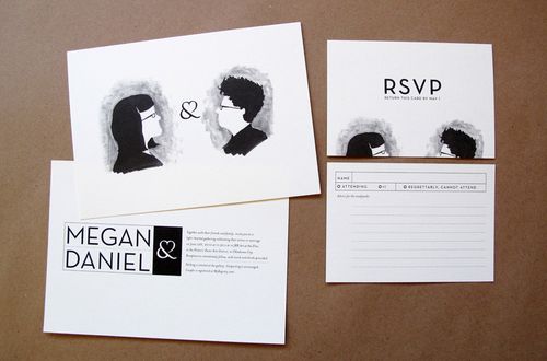
(Megan + Daniel at Oh So Beautiful Paper)

Oh! It turns out these are designed by Kathleen, whose own wedding invites had the lovely vellum paper/typewrite/kraft paper combo I posted about previously. Note the ampersand modified to include a heart, clever. I think I would've preferred a softer font/layout for the main info card (the one that says Megan Daniel), it might suit the watercolor illustrations better.

Watercolor illustrations (and pen drawings, a la Danny Gregory) are something I've always wanted to develop as a skill. I'm not an Artist or really a sketcher or drawer but I do enjoy slipping into that right brain drawing mode when I've taken art classes. This is really, really dorky but after I made a Personal Development Plan (PDP) for work (yeah, I know, but really it's helped with prioritizing which things I want to work on!), I made a rough one for personal hobbies and pursuits, which has the following items on it:
  1. Create a beautiful, cozy, organized home (we're moving again in a few weeks! so posting may die down a bit again, or just continue on the mostly fluffy here's cool stuff I found on other blogs vein I've had going thus far while we get into and settle in the new place. I haven't been entirely pleased with the job that I'd done with our current apartment but I'll chalk it up to not really loving the space all that much)
  2. Develop a regular exercise routine with dance classes (possibly at this studio in Hoboken, which would be convenient since it's right near the PATH train) and long walks with Dan. Maybe also the yoga classes Meghan and Abby have been taking, and maybe restarting that Couch-to-5K plan that I've tried a few different times so far and got most of the way through once. A good friend of mine just completed her first 5K this past weekend and I was so happy for her! I often wish that liking running would come to me more easily. I recently gave up my gym membership, since we're moving, and that's been a relief. Definitely not going to become a gym person when I didn't go often to a gym that was just around the corner from our current apartment.
  3. Fix up wardrobe with own sewing work and learning to sew tops and dresses, working towards the wedding dress (aka 'fun easygoing red dress that I will put in the effort to make muslin mockups and such and that I will be able to wear again afterwards without causing a scene). Once most of the work in outfitting the new apartment is done, I'd like to take some of the classes offered by Sew Fast Sew Easy, starting with their Intermediate skirt class and progressing to the advanced classes on dressmaking.
  4. (and finally winding up the earlier topic, here in 4th place is) Illustrated watercolor journaling. This instructional DVD on 'Beginning Watercolor Journaling' seems like it'd be a good substitute for an in-person class, though I've also found some drawing and painting the city classes that might be fun as well. There's a slight chance I might be able to take the 'Illustrated watercolor journaling' class in California at the end of June when I'm out there for a work trip, but I'd have to work out a way to get to Santa Cruz Mountains from the Palo Alto area.
I'm really no artsy-crafty paragon or anything like that, though. Abby graciously bequeathed some of her magazines to me so I can create an inspiration board of colors and textures for the wedding and I'll post a picture of what I've got so far when I get a chance. My Costume Design* teacher always said I needed to do more editing on my mood boards, a concept I understand a little better now, but I still just enjoy a wide range of different things that that's hard for me to do. 

*Again don't get me wrong, I was a Biology/Psychology double major in school. Costume Design was one of those classes that I took when I had my mid-college 'rebellion' against my parents wanting me to finish the bio major and I was just like, FINE, I will TAKE 7 classes when most people take 5 so that I can fit in both majors, a fun class, and study abroad in Melbourne the next semester. I'll show you! Ha! Anyway Costume Design ended up being one of the best classes I took in college**, it was just so fun to have 'make a collage' and 'collect fabric swatches' as homework assignments. I'd take breaks from my harder classes by doing homework for this fun class instead.

**Other great classes include Australian Wildlife Biology (here's a species of ___ only found in Australia, we're not sure if it's still around or not, the last time we sighted it was 15 years ago when it was discovered in the stomachs of some roadkill in the dessert...), Intro Physics (loved the professor that much), and of course the Western Cultural Tradition classes we had to take as part of the honors program, where I learned critical thinking and how to actually propose and defend a thesis in a paper (I did not come out of high school with very much of this particular skill).

***There isn't actually a 3 asterisk next to something, I just wanted to point out that I have somewhat intentionally tried to throw in more random about me personal stuff so that my posts aren't all just 'pretty things I found' kind of posts. Evidently I'm quite the rambler when I write (one of many reasons why I have never considered myself a Writer either) so perhaps I should start making liberal use of footnotes, like Lyn at Another Damn Wedding or Robin at HitchDied who ups it a notch with the numbered superscript footnotes (one example). 

Google Maps envelopes

How cool is this Google Maps envelope idea from Rahul Mahtani & Yofred Moik from the Industrial Design program at Syracuse University?? Via not martha.

Their full design idea is for this to be built into Gmail so that you could have the option to convert an email into a physical letter, mailed by the USPS, but you could also print out a map image on a regular piece of paper and use something like this 8.5x11" envelope template to cut out and create your own envelopes more.

Cons:
  • seems like it could easily become a lot of work for something people will toss aside quickly (hopefully into their recycling bins, at least)
  • would there be any easy way to also put the location of our venue on the envelope as well? Does that even make sense as something to do? Or just a big X - we're getting married here!! Or have a mini-maps image on the card inside to indicate the location? Which would then almost be like, yes, we've thought about it long and hard and we'd like the theme of our wedding to be Google apps: Google maps, separate wedding Gmail account, wedding website built with Google sites, RSVP forms using Google spreadsheets...I could go on for ages (I am only half-, perhaps one third-joking)
Pros:
  • it thrills my nerdy sense of awesome
  • even Dan allowed himself to think it was really cool for several minutes before the 'seems like too much work' voice chimed in. And even then, once I told him we could put him in charge of data entry and I would recruit help for the cutting and folding, he seemed like he'd be ok with it. [Dan asks me to clarify that he's just in touch with his lack of crafty skill but can make up for it with his skill with maps.]
  • hopefully people would feel more acutely how it's a small event that we'd really love their presence at, what with the time we've taken to personalize their invite? OK I think this is where non-wedding blog readers would mostly be like, in the real world people pay far, far less attention to these kinds of little things than you think they might (countering the slightly hysterical WIC mantra of "your invitations set the TONE!!!")
On a slightly different note, quick tip picked up from Nothing But Bonfires today: the $35 Xyron machine that can turn items printer on normal printer paper into a label/sticker, like so:

(note she also used a special corner-rounder thing)

Maybe this could be combined with the above idea where instead of folding envelopes from maps you just convert a map screenshot into a sticker.