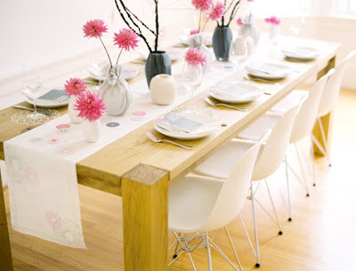
The first post of the new column at DesignSponge, "Beyond the Big Day." Cute and quirky, to be inspired by the spirograph, and I like seeing how the theme is translated for the different parts, though the photos feel just a little bit too obviously styled to me.
(So simple and clean-looking! We'd definitely be able to manage flowers at this level.)
(I really like typography as graphic design, I think.)


0 comments:
Post a Comment